Home / Works / Strategic Rebranding: SoReal → RealAgent

Case Study · Real Estate / PropTech SaaS · 2024

Strategic Rebranding: SoReal → RealAgent

Orchestrated a comprehensive identity migration and digital infrastructure overhaul to modernize market positioning, preserving 100% of the existing user base.

The Challenge

Transitioning a legacy brand identity without fracturing user trust, disrupting operations, or diluting market visibility.

A corporate name change risks immediate user confusion and customer churn if executed poorly. The transition demanded a flawless, simultaneous cutover across the marketing website, product UI, social ecosystems, and internal sales infrastructure, requiring a bulletproof change-management communication strategy.

Strategic Rebranding: SoReal → RealAgent — cover
The strategy

Four moves, sequenced

01 — Brand Governance & Synthesis

Championed executive workshops to establish and codify the new visual language, typography, and verbal identity, culminating in a comprehensive Brand Guidelines framework.

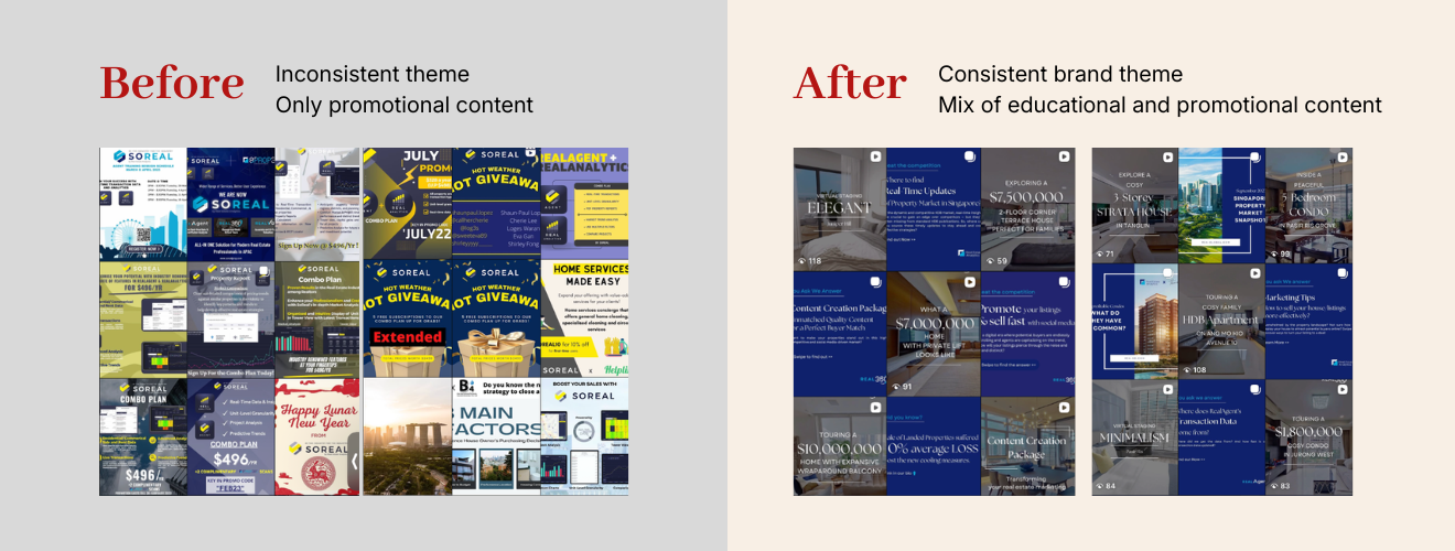
02 — Omni-channel Architecture

Designed and project-managed a phased go-to-market rollout plan spanning a complete marketing website UI/UX redesign, synchronized social media realignments, and unified asset updates.

03 — Change Management & Retention Comms

Formulated a high-touch user migration roadmap utilizing targeted, segmented email journeys and narrative-driven content ("Why We're Evolving") to anchor user trust.

04 — Cross-Functional Activation

Served as the central bridge between engineering, product, and sales to synchronize the simultaneous cutover of live web/app environments and train internal teams on the new brand voice.

The result

Measurable lift

0%
Customer churn achieved during the cutover window, maintaining 100% user retention.
100%
Visual and narrative consistency achieved across web, mobile product UI, social media, and internal collateral.
Flawless
Cross-departmental launch execution delivered on schedule with zero operational downtime or internal messaging misalignment.
Reflection

The true triumph of this project wasn't the aesthetic evolution—it was the retention story. Customers rarely churn simply because a company changes its logo; they churn when the transition feels disruptive or self-serving. By framing the rebrand around user value and proactively bringing our community along on the journey, we turned a high-risk operational pivot into a celebration of growth.

Long-form editorial body reserved for v2.